Widget styling and customization
The best way to style and customize the widget is using StorifyMe Widget Editor, which is a visual tool available inside StorifyMe platform.
SDK specific styling
Loading animation
You can display a loading animation while the story widget fetches and renders content.
The loading animation is disabled by default. You must explicitly enable it with setWidgetLoadingAnimationStyle.
Default animation
Enable the built-in spinner with an optional tint color:
// Default gray spinner
storifyMeWidget.setWidgetLoadingAnimationStyle(enabled: true)

// Custom tint color
storifyMeWidget.setWidgetLoadingAnimationStyle(enabled: true, color: .systemBlue)
Custom animation
Pass any UIView subclass to fully replace the built-in spinner. The view is centered inside the widget while content loads and removed automatically once loading completes.
let loadingView = MyLoadingAnimationView()
storifyMeWidget.setWidgetLoadingAnimationStyle(
    type: .custom(view: loadingView),
    enabled: true
)
Below is an example of a dot-wave loading animation — 12 dots arranged in a circle with a staggered pulse effect.
Click to view DotWaveLoadingView example
import UIKit

class DotWaveLoadingView: UIView {

    private let dotCount = 12
    private let animDuration: TimeInterval = 1.2
    private let delayPerDot: TimeInterval = 0.1

    private var dotColor: UIColor = .darkGray
    private var displayLink: CADisplayLink?

    override init(frame: CGRect) {
        super.init(frame: frame)
        backgroundColor = .clear
    }

    @available(*, unavailable)
    required init?(coder: NSCoder) { fatalError() }

    override func willMove(toWindow newWindow: UIWindow?) {
        super.willMove(toWindow: newWindow)
        if newWindow != nil {
            startDisplayLink()
        } else {
            stopDisplayLink()
        }
    }

    override func draw(_ rect: CGRect) {
        guard let ctx = UIGraphicsGetCurrentContext() else { return }

        let cx = rect.midX
        let cy = rect.midY
        let circleRadius = min(cx, cy) * 0.75
        let dotRadius = min(cx, cy) * 0.11
        let now = CACurrentMediaTime()

        for i in 0..<dotCount {
            let angleDeg = -90.0 + Double(i) * 30.0
            let angleRad = angleDeg * .pi / 180.0
            let dotX = cx + CGFloat(cos(angleRad)) * circleRadius
            let dotY = cy + CGFloat(sin(angleRad)) * circleRadius

            let delay = Double(i) * delayPerDot
            let elapsed = (now - delay).truncatingRemainder(dividingBy: animDuration)
            let wrappedElapsed = elapsed < 0 ? elapsed + animDuration : elapsed
            let t = CGFloat(wrappedElapsed / animDuration)

            let pulse = (1.0 - cos(2.0 * .pi * t)) / 2.0
            let alpha = 0.3 + pulse * 0.7
            let radius = dotRadius * (1.0 + pulse * 0.5)

            ctx.setFillColor(dotColor.withAlphaComponent(alpha).cgColor)
            ctx.fillEllipse(in: CGRect(
                x: dotX - radius,
                y: dotY - radius,
                width: radius * 2,
                height: radius * 2
            ))
        }
    }

    func setColor(_ color: UIColor) {
        dotColor = color
        setNeedsDisplay()
    }

    private func startDisplayLink() {
        guard displayLink == nil else { return }
        let link = CADisplayLink(target: self, selector: #selector(tick))
        link.add(to: .main, forMode: .common)
        displayLink = link
    }

    private func stopDisplayLink() {
        displayLink?.invalidate()
        displayLink = nil
    }

    @objc private func tick() { setNeedsDisplay() }
}
Use it with the widget:
let dotWave = DotWaveLoadingView(frame: CGRect(x: 0, y: 0, width: 60, height: 60))
dotWave.setColor(.darkGray)

storifyMeWidget.setWidgetLoadingAnimationStyle(
    type: .custom(view: dotWave),
    enabled: true
)
Disable animation
storifyMeWidget.setWidgetLoadingAnimationStyle(enabled: false)
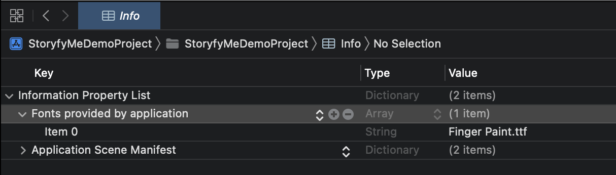
Custom font
Download the font, it should be in .ttf format, maybe some others will do.
Place it somewhere in the project you want.
In Info.plist you need to set
- Source code
<dict>
....
<key>UIAppFonts</key>
<array>
<string>Finger Paint.ttf</string>
</array>
....
- Regular view
Opening story animation
Stories presenting can be customized by setting StorifyMeStoryViewerOptions.
The default behavior is listed below and can be easily customized.
storifyMeWidget.setStoryViewerOptions(
                options: StorifyMeStoryViewerOptions(
                    thumbnailItemOpeningAnimationDuration: 0.2,
                    thumbnailItemClosingAnimationDuration: 0.2,
                    storyPreviewerOpeningAnimationDuration: 0.2,
                    storyPreviewerClosingAnimationDuration: 0.2,
                    enabled: true))
If for some reason you want to disable the animations, just use the code below.
storifyMeWidget.setStoryViewerOptions(
    options: StorifyMeStoryViewerOptions(
        enabled: false))
Grid Collection View Behavior
StorifyMeGridCollectionViewBehavior which offers flexible options for customizing the behavior of grid collection views. This includes the capability to adjust the height of the first story using the setGridCollectionViewBehavior(.adjustFirstStoryHeight(byMultiplier:)) method.
storifyMeWidget.setGridCollectionViewBehavior(
    .adjustFirstStoryHeight(byMultiplier: 0.75))